IKEA self-scan checkout
The project
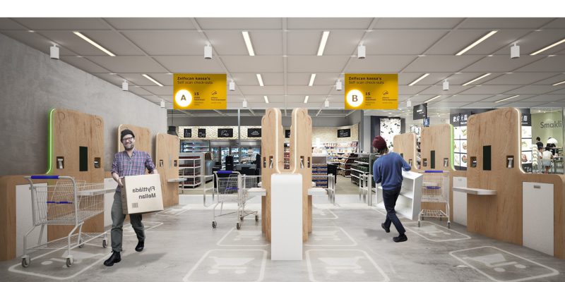
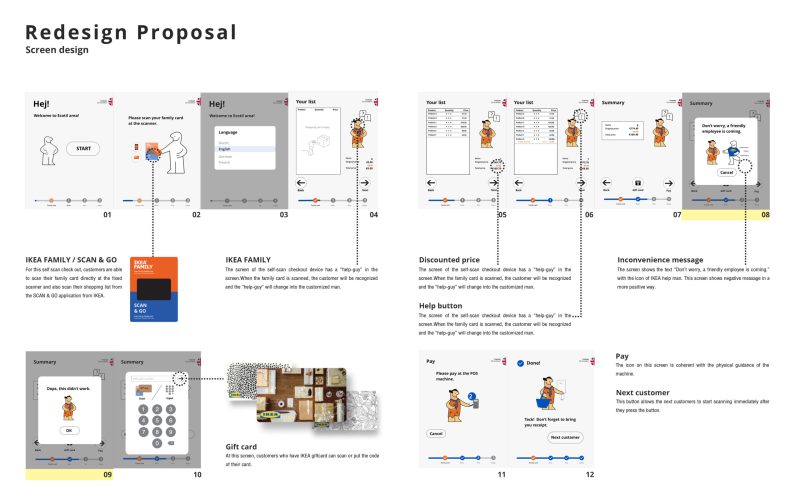
The IKEA Self-scan checkout is a redesign of the current self-scan checkout to better fit the IKEA experience. The redesign guides the user through the process by using process indicators in the form of numbers and colors. The physical shape is designed to suit all the needs visitors have during the checkout process. The redesign makes the whole process more simple, practical, and efficient.
Project details
Year: 2019
Client: IKEA Delft, TU Delft
Nature: Group project
My tasks: Ideation, Prototyping, Usability testing, Interviews
Assignment
The goal of this project was to improve the IKEA shopping experience by making the self-scan checkout more part of this experience and more coherent to the overall IKEA style.
Context
Ecotils, or better known as the self-scan check-outs, are check-outs where customers can scan, pack and pay by themselves. One employee can watch several Ecotils at the same time and can provide help when needed. This area is meant for a maximum of 15 products per customer and it is only possible to pay by card or gift card. Three Ecotils fit in the area of one normal cash desk.
Analyse phase
The first step was to understand the current context. Observations and interviews were done to understand the process and the biggest flaws of this process. Both customers and IKEA employees participated in this study.
Insights
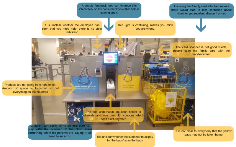
There are problems with the physical design and digital design of the current checkout.
1- The shape of the ecotils leaves no room for your shopping cart. Customers have to park their cart behind them or sideways. Making the cart an obstacle for other visitors
2- Several objects physical and digital are present but not used in the process anymore, causing confusion and slows down the process.
3- The overall process does not feel friendly as the tone of voice is very practical. A bright red light turns on when you make a mistake almost shaming the customer for needing help.
Concept phase
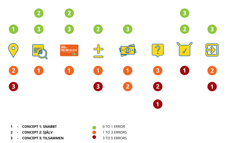
3 concepts were created to suit different styles of shopping. Doing it yourself, fast, and doing it together with your family. The concepts were evaluated with low-fi prototypes and cognitive walkthroughs with university students. Inconveniences were found to assess the concepts.
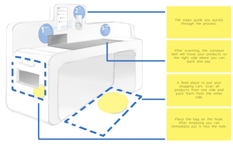
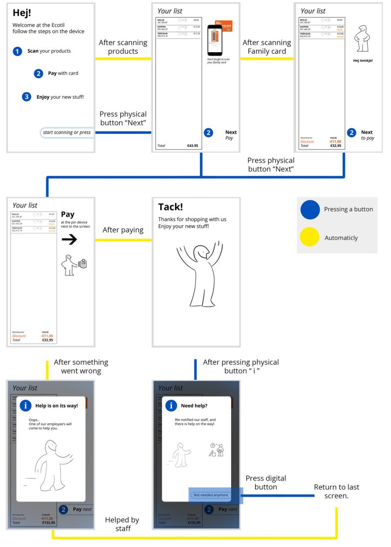
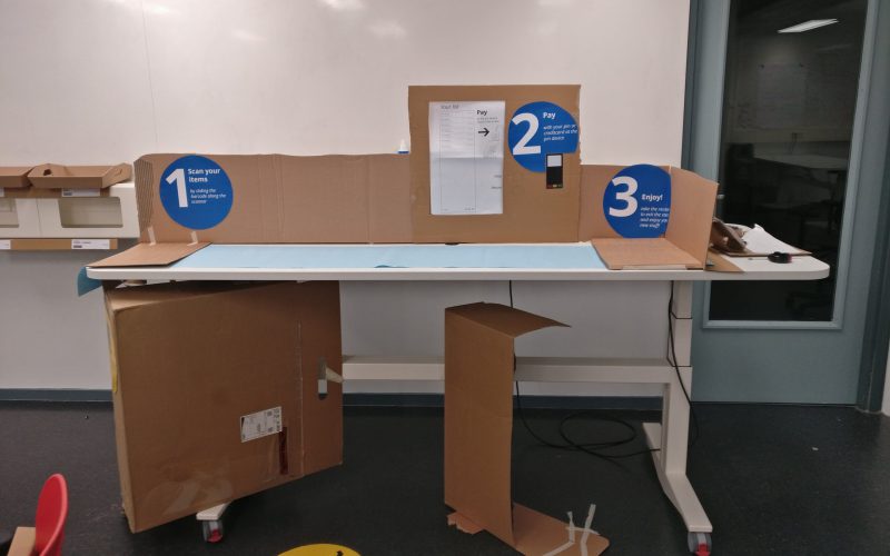
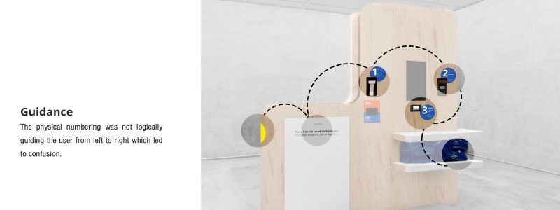
Key insight: Visualizing process indicators both digital and physical made it easier for participants to understand where they are in the digital process. (Numbers 1,2,3)
Final concept
The Snabbt concept proved to be the best working concept with the least errors. This concept was improved using positive aspects of other concepts.
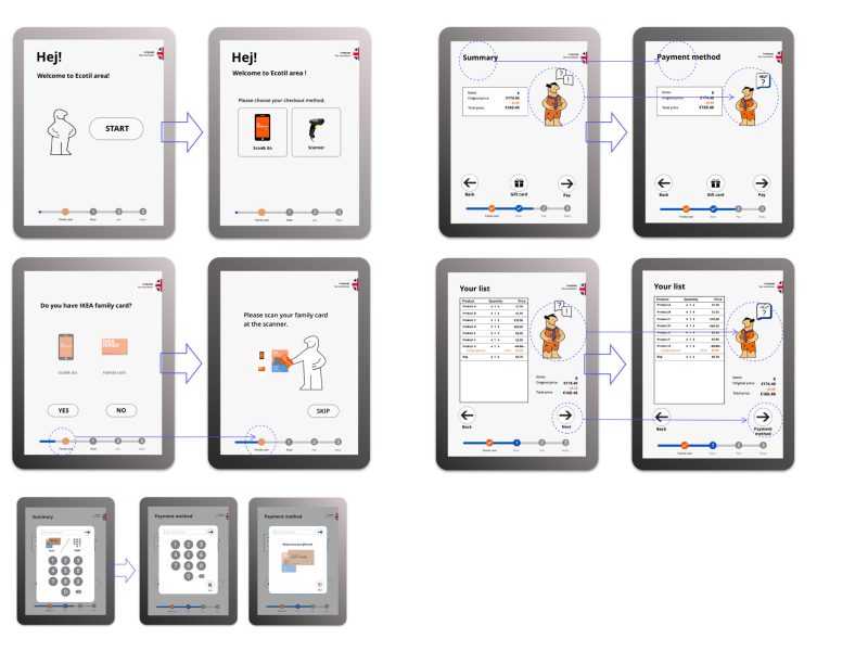
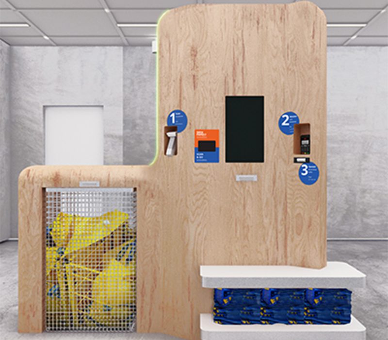
Wording and visuals were changed to better indicate the corresponding process.
Evaluation
A higher quality prototype was made to do a cognitive walkthrough. The digital interaction was made using Adobe XD and the physical interaction with lights and scanning was made using Arduino.
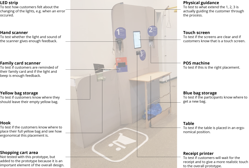
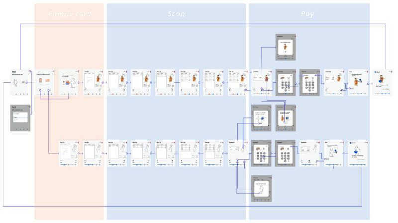

Video recordings were used to analyze inconveniences found during the study. Inconveniences were mapped based on the reason for the inconvenience and in which part of the process it occurred.
Things I learned during this project
1- An interaction can seem simple and clear on paper but a user will always find a way to misinterpret the interaction, Therefore user testing is essential.
2- Small changes in wording or visualization can make big changes in the understanding of the interaction. Sometimes the concept is good but needs a small tweak that can work wonders.
3- Creating a real-like experience when testing the interactions helps the user react more naturally. This will create more honest and valuable feedback


